Black’s inky tones have attracted stylish individuals and scene-makers throughout the past and present; worn at word-of-mouth gigs, bars, raves and club nights, found in forward-thinking boutiques, emanating from music videos and Instagram, or featured upon covetable record sleeves. Black is, after all, timeless, trend-defying and effortless. Unsurprisingly, its allure has been similarly harnessed by the most directional of fashion designers across the globe and the decades. From a deliberately restricted palette of black, their newest collections have oozed its hues for maximum impact with minimal fuss.
Ska and the black and white 2 Tone Records logo
Key music movements of the 20th Century were characterised by impeccable graphics that have stood the test of time. Distinctive 1950s and ‘60s Blue Note jazz album covers were designed by Reid Miles with photography from Francis Wolff and still look modern. As does the cut-and-paste lettering and brash colouring created by Jamie Reid in the 1970s for the Sex Pistols’ record sleeves and merch. Here, we check out the simple black and white record label logo that complimented the early-1980s Ska scene so perfectly and still feels fresh today.
Exploding from Coventry during the early 1980s, the Ska scene was pioneered by local bands such as The Specials and The Selector – followed by Madness, The Beat, The Bodysnatchers and Bad Manners, among others. It attracted a genuinely multicultural mix of ex-punks, rude boys and girls, skinheads and mod revivalists. The music was speeded-up 60’s Jamaican ska rhythms, combined with reggae vibes and a bouncy punk-ish energy, along with no-nonsense lyrics about contemporary urban life for UK youths. The clothing worn by young male and female Ska devotees at the time was ultra-smart and timelessly cool – notably including pork pie hats, slimline suits, loafers, Doc Martens, Harrington jackets, Fred Perry polo shirts, braces, white socks, button-down shirts and skinny ties.
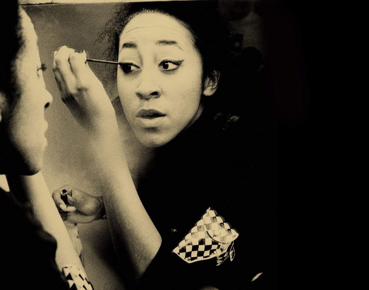
One of the most iconic aspects of this movement, however, was the minimal-yet-witty black and white logo for the 2 Tone Records label, founded by Jerry Dammers of The Specials and from which many of the key singles and albums of the time were released. This resulted from a collaborative creative effort, between Dammers and Horace Panter, The Specials’ bass player, along with the art director David Storey and his graphic designer/illustrator colleague, John ‘Teflon’ Sims. The logo centres around a simple illustration of a male figure with his hands in his pockets, sporting a neat black suit, white shirt, black tie, white pork pie hat, black wraparound shades, white socks and black loafers. The initial concept for this instantly recognisable figure came from image-conscious Dammers himself. He was inspired by an archive photo of Pete Tosh, a one-time member of Bob Marley’s backing band, whose feisty style and attitude Dammers much admired. He took further inspiration from an old black and white old pop art image, which resulted in the black check pattern. The Specials bass player, Horace Panter, chose the distinctive Helvetica Inserat black font for the ‘2’ in 2-Tone Records. The male figure was brought to life via Sims’ deft drawing skills and duly nicknamed Walt Jabsco, because Dammers had recently purchased a vintage American bowling shirt from a charity shop which had that same name sewn across it.
The impact of the 2 Tone Records logo was swiftly felt and became ubiquitous. Walt Jabsco imitations popped up on bootleg T-shirts, badges and patches far and wide, as well as being replicated by appreciative young Ska fans in doodles of black ink and white Tipp-Ex upon their school books and school bags. “The 2 Tone identity had an immediate effect on the creative landscape of that time,” confirmed David Storey, in a 2017 interview with Vinyl Factory. He also recalled the influence of 2 Tone Records and early-80s Ska eventually seeping into the realms of high fashion: “I remember Junior Gautier [the designer Jean Paul Gaultier’s lower priced line, launched in 1988] producing a collection that used the checkerboard pattern and some of our other elements as the main motifs.” All of which goes to show that vivid colours and complex graphics are not necessarily needed when communicating a visual message. Sometimes black, contrasted with white, is the most stylish statement of all.
The checkerboard motif continues to be referenced and reinterpreted throughout Fred Perry’s collections – most recently in the Amy Winehouse Foundation collection with the print appearing within love hearts and trims.
